Dreaming in Color - Color Balancing with Jean Wells
The past two months have been filled with the bright colors of summer even though it is winter in Sisters. This is the time of year that I work on quilts that will be donated to fundraisers for Sisters Outdoor Quilt Show. Our theme for our 45th anniversary show this year is “My Kind of Town.” As always, I began my project by pulling as many fabrics as possible in the colors I choose to work with. Once that's done, I turn to balancing colors in my composition.
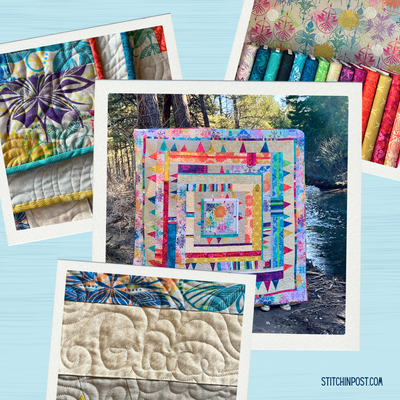
“Summertime” is my 22” x 34” quilt for the Storybook that Dan Rickards of the Clearwater Gallery creates for display during Quilter's Affair and Sisters Outdoor Quilt Show. As I thought about this year's theme, what came to mind is our wonderful little town and looking out onto the landscape that surrounds us. As I looked at my fabric choices, I could see a strong contrast in temperature (warm vs cool colors). My challenge would be to balance this contrast out as I made my final fabric choices.
The top portion of the piece is mostly cool colors with a few bits of warm accents. I made a decision to use the deep magenta as an accent throughout. Since I was working mostly with solids, I looked for fabrics with visual texture that would add interest. You can see the textured blue in the sky and the two textures in the cottage.
The photo above is where I start transitioning into the lower field area, there you start to see more warm colors. You can see where greens and yellow ochre begin to play a bigger role. Notice that you still see the magenta, and a bit of really pale pink to mimic the pink in the sky above. Also in this area, French Knot embroidery adds a playful feeling and introduces the idea of a summer garden up close.
To carry through with the landscape feel, the sections of fabric became larger. It took me a bit of time to balance out the colors, always referring to what came above. Proportions of the shades of yellow ochre really came into play. I sketched a playful garden and planned to add over the top of this area. Originally, I was going to hand applique leaves and flowers there.
But, as I added the patterned fabric, it felt really busy and did not honor the colors and piecing above. So, I abandoned the idea and free motion sketched the lines and shapes, then filled in some subtle color with embroidery.
This just goes to prove the point that I tell the students in the classroom: When you get to the last one third of telling the story in the design process, the quilt will tell you what it needs. We just have to listen!
Another recent project related to the upcoming Quilt Show is fabric postcards. I created three 4” x 6” postcards for the WISH Upon A Card project, to be auctioned during Quilter's Affair (two are pictured above). The proceeds go toward an art scholarship for a deserving high school student in Sisters. If you are interested in making a card, go to the Sisters Outdoor Quilt Show website. You can contact them with your mailing address and request a material packet. During the week of Quilter's Affair, cards will be on display at the High School, and available for sale during the lunch hour.
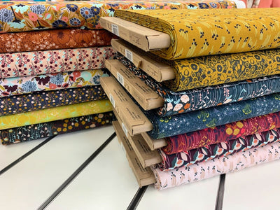
For those interested in experimenting with the color palette from my Summertime quilt, we've created a summertime fat quarter bundle with six of the fabrics I used.