Dreaming in Color - Dull vs Bright with Jean Wells
Dull vs Bright --- A Form of Contrast
When I say the word “dull,” I find students kind of sit back, take a breath, and relax. The word itself is not very exciting and when you put a dull fabric next to a bright one, the bright one always says “Hey, look at me!” Use this to your advantage when you are choosing fabrics for a quilt, especially in scrap quilts. Dull fabrics create a foundation for the rest of the activity that goes on in the design.
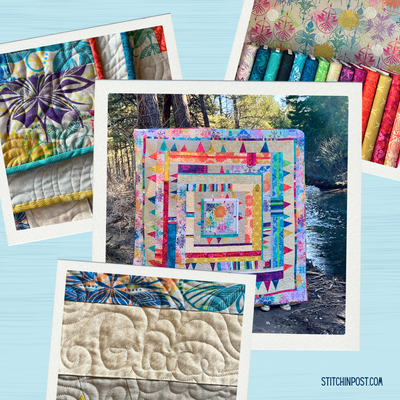
Amafu is a New York Beauty style quilt that I created over fifteen years ago and is still one of my favorites.
I would call this a scrap quilt and as you can see, there are traditional fabrics as well as ethnic ones, batiks, hand dyes, and solids. This style of quilt takes a long time to make so there is plenty of opportunity to add fabrics along the way. I really enjoy the process of letting a quilt take on a life of it’s own. When you do, you will look for what the quilt needs and not get stuck on having to use your favorite one.
The blocks for this quilt came from an out of print Karen Stone New York Beauty Book. We do have Radiant New York Beauties by Valori Wells with 14 paper pieced quilt projects.
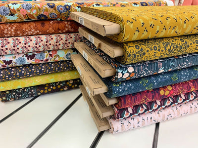
Kaffe Fassett is a master when it comes to color usage and I have learned so much from him and his textiles. Many of his fabrics read as bright, intense, or colorful. When you look closely, you will see that there is usually a duller fabric that becomes a platform for the bright ones. Most of the time the color of the dull fabric falls into the category of what I call a “no name color,” because it is not a pure color like you see on the color wheel. It will get a name like stone or ash, because people want to describe it and end up naming it after something.
Pine is one of my favorite contemporary quilts. When I went to choose the color for the darker image I did not want black, so I choose a variety of darker, duller shades (forest green, charcoal, deep purple, brown). To me, it made for a more interesting image. As a shop owner and teacher for 44 years, I can tell you that dull fabrics are the last to sell in the store. They get lost, but when I can show a customer or student how they make the other fabrics sing, the light goes on. Setting the darker, duller fabrics on the warmer gold tones seemed to create a warmer feeling in the quilt.
In March, we visited about opposite colors on the color wheel, and I recently came across these blocks which are opposites on the color wheel–orange and blue. But, the orange has been pushed into deeper orange tones and the blues into teal colors. I will be working on this in my Intuitive Color and Design workshop in May, and will give you a progress report then.
As you can see from my work, solids play a big role. I have found that solids allow me to explore color relationships without the interference of pattern, and I learn even more about color. Kona Cotton solids are my favorites.
-Jean Wells