Dreaming in Color - Mysteries in Nature with Jean Wells

How else do you describe some of the wonderful color combinations found out in nature? They can be mysterious. On a summer visit to the Oregon Coast I discovered a small garden just as you drive into Manzanita. It was full of plants that I had never seen before as well as sculptures by local artists. The rainbow colors painted on the handles of the garden tools drew me right in to take another look. I want to decorate my garden next summer with painted garden tools.

The colors and textures were a feast for the eyes. Scottish Heather was my favorite color combination in the plants with the salmon type oranges, bits of lavender, and acid green. From the photograph below look closely for subtle orange color changes, and pay attention to the proportion of the oranges to the green and lavender. The magic is in what mother nature has done with this plant and the proportion of the colors is just as important as the colors themselves.

This plant was such interesting texture I just had to include it. The cool greens were a perfect backdrop for the warm tan and brown in the leaves. Temperature is a really nice element to use for contrast when you are planning a color scheme

Oswald State Park just north of Manzanita is a beautiful walk through an old growth forest that ends at Short Sands beach. In Central Oregon we call a plant similar to this one with the magenta flowers fireweed, but I am not sure if that is correct in the beach variety. With the overcast sky the colors of the plant became even more vibrant. The magenta tones seen here have become my go to accent color lately. I find they are lovely with the browns in wood as well as partnering with saturated solids.

As you look at this photo take in the subtle colors in the landscape. These neutral like tones play such a big role when you are choosing a palette for a project. They are subdued and will act like a foundation holding up the brighter ones making them sing in a quilt. Below are several photos of neutral like colors. When you look closely at them you will see undertones of other colors.


When I returned home from the beach the local sagebrush “Rabbit Brush” was beginning to bloom. This is a favorite palette of mine that I have visited several times in my quilts. It wasn’t until Rosalie Dace came to Sisters the first time that I took a close look at the plant. Coming to Sisters from the airport she asked me to stop so she could look at them. It was then that I noticed the colors of the stems and dead parts of the plant in the wonderful greys. I think of this often when I am walking, especially someplace new. Then I take time to stop and explore when I see something interesting ---color---texture---line.


The Metolius River walks in Camp Sherman are some of my favorites. No matter the season I always see something interesting that captures my eye and ends up in my work in the future. For me walking is meditative and I get in a zone that allows me to feel the environment as well as see it. During most of the year shades of blues and green dominate the landscape with the brightest blue skies ever. Whenever we have visiting teachers in Sisters they marvel at our blue skies. And then there is winter with its own color palette.


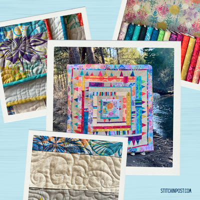
I waited until the Artisan Cotton wovens arrived to pick the pencil pack colors to go with this blog. What I love about the collection is the that the warp and weft are different values and sometimes colors. That creates a feeling of depth that you do not get in regular solids. We ordered every single piece as they are such a great addition to our solid color collection. I hope you will enjoy them, there are so many interesting colors to choose from.