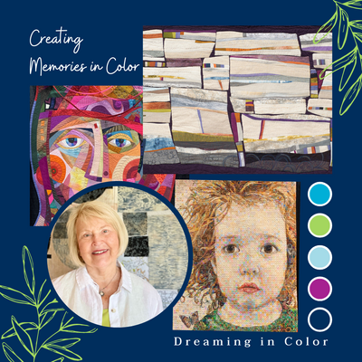
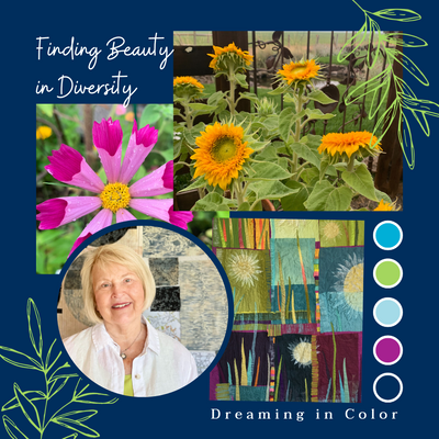
Dreaming in Color - It is not just Black and White! with Jean Wells

As we begin 2022 let’s take a look at basic vocabulary when it comes to color. Over the years, while teaching workshops, I found that when it comes to color discussions there were descriptive vocabulary words that kept emerging: value, intensity, temperature, and complementary colors. They are now the foundation of my color discussions in the classroom.

Let’s begin with value….dark vs light. Black and white are opposite of each other in value. When it comes to making a quilt in black and white you will find that prints in black and white will appear darker or lighter. If a print has a black background and white motifs it usually appears darker and the reverse is true with a white background.


In August of 2020, I pulled a collection of appliqued stone blocks and began a creative journey focusing on a black and white palette. During this time, there was so much unrest in our country and with upcoming elections. “It is not just black and white” was forefront in my mind as I listened to the news reports, making this one of the few quilts I made when feeling troubled. I stitched and stitched my worries into this piece. I felt like I was creating neighborhoods as I arranged the blocks into groups. Some warmer neutral tones creeped into the color mix. You can see the quilt below. In the composition I tried to create groups that all worked into a whole community.


I was still in a black and white mood and decided to remake Steppin Out, a quilt I created in blue and red ten years ago. Adding the narrow strips of gold just seemed to work for an accent color. In the next color study piece, gold played a larger role than the black and white, although all three colors are still evident. You will also notice that black and white have mixed to make some interesting greys. When you work with patterned fabrics texture starts playing more of a roll in the design.


This leads into another vocabulary word intensity. Intensity is dull vs bright. Bright colors are the happy ones that grab us. They say “look at me!” when used in a quilt. The duller colors are the ones that create the foundation for the bright colors to sing in. Kaffe Fasset uses dull tones as a backdrop in lots of his intense floral prints. Mother nature outdoes herself with the summer colors in flowers.


In nature, the brown tones in the ground look duller than the sun-bleached Manzanita branches that appear bright. In another setting that grey color would probably take on a dull roll. This is what is so much fun working with color. Another of the vocabulary words is temperature, warm vs cool. I find when I am designing a quilt, if it is mostly warm colors, I will slip in a cool one and vice versa. Look at how warm the flower colors are above! Below the dead manzanita branches are definitely cool where the growing branch is warm as well as the pine needles on the ground.


This stone photo tells a wonderful color story. The dull grey rock shapes are evident because of the dark and dull black spaces between the shapes. And the bright blue sky becomes a delightful intense accent color. See how these words can be used when you are trying to describe what you are seeing.

Let’s take a look at a quilt I just finished and I will take you through the design process. This fall, on a drive to Clear Lake near Sisters, I was so taken with the tree shapes as the leaves began falling. When we came home from the drive I started looking through some of my hand dyed fabrics and batiks for possible trees. When I came upon the gold fabric that you see on the left of the piece below, an imperfection I had sadly created in the dying process all of a sudden became an important design element in the tree shape. That experience really spurred me on. The far hand tree on the right's fabric is a batik that Valori created over 20 years ago that I have scraps of and it really played well with the gold tree. Then I started pushing through my batik pile of fabric and came across the teal fabric. It just felt perfect.


As I looked back at the rainy day forest photo I took, I really like the very quiet neutral background. That gave me the ideas for the variety of neutrals you can see in the background. When you think of the vocabulary words discussed above they start appearing in this quilt---light, dark, dull bright, warm, cool!
My intention for 2022 is to “Train my eyes to see the beauty around me.”
This post inspired me to put together three new pencil pack collection: