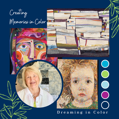
Dreaming in Color with Jean Wells - Spark Your Imagination

Choosing colors for a project can be a delightful exploration, but at other times very challenging. With spring just on the horizon, I felt it would be a good time to share some thoughts on color that I refer to time and time again. You never know what will spark your imagination when you are in the design process.
Color is the eye catcher! When you walk through a quilt show the use of “color” in the quilt is what will grab you first. Time and time again I have marveled at a color combination. I am always on the hunt for colors I see together that I would not have thought of. Printed fabric is always a place to begin when choosing a palette of colors.

When this rust background floral arrived last fall at the store, I just had to have some. What struck me was the other colors the artist chose to put on that background color. It was not your typical fall palette. I was in the middle of teaching a workshop, so I decided to pull other fabric friends that could play with this print. The blue tones being more on the cool side really spoke to me, as well as the shades of red (wine, magenta, pink, and true red). At this point in the design process I pull anything that might work. I do not start arguing with myself. I decided to push the blues to a slightly warmer tone as well as push the rusts. Lighter and brighter. A bright orange was included, just in case.

Little did I realize that I was working with complementary colors blue and orange. As I gave students assignments, blocks and components were created. Once I had a good variety of parts, I began the composition process. Because of the many smaller parts, I was able to add variety in pattern and color with the fabric choices to make the quilt more complex looking.


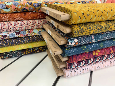
This spring Art Gallery Fabrics presented a print with a creamy white background (pictured below). What I noticed was how much brighter the colors feel. The blue is a warmer aqua and the dark green foliage is now a warmer olive, and they added gold. I was inspired to put together another palette.

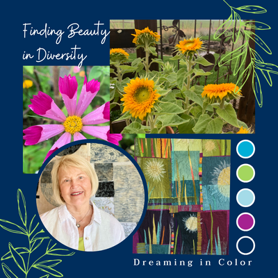
Nature, advertisements, greeting cards, special occasions, and vacations are all sources of inspiration. I find that when I visit a new place something will usually speak to me - it might be the culture, nature, the feeling of the place.


Not only do I find ideas for color, but also ideas for line and texture can come into play, as you can see in the palm trees above. I would not have thought of using grey, charcoal, and white in a palette with the greens, but they work for me.
A memorable trip to Morocco, on a Creatives Retreat right before COVID hit, with Valori and Kelly Sheets filled my head with inspiration. The first thing I felt walking through the marketplace was color and pattern everywhere. Clash it up or you can’t tell the colors apart is one of my favorite sayings when I am choosing a wide variety of colors. I do try to make one of the color families more dominant, so the piece does not come across as a competition.


As I studied the colors and pattern in this handmade carpet, I thought about my dear friend Freddy Moran. The first time I visited her garden there was an entire area with just green and white. The rest of the garden was a riot of color. I asked her about it and her comment was, white is a beacon of light in the garden. I feel that in this carpet. You see the white and you pause. You need a variety of lights, mediums, and darks –to help define the design shapes. This carpet is a great example of variety in color and the white really makes it work.

Just outside of Marrakech, we traveled to the desert for a beautiful luncheon in a tent and then a camel ride. In this very neutral palette, I found myself relaxing and really looking around and noticing line and shape. As we know earth colors work with all of the others, and you need dull fabrics to set off the pretty ones.
At Christmas that year, I opened my gift from Valori and here was this beautiful embroidered piece that reminds me of my trip to Morocco. Not all neutrals are created equal, look beyond the obvious ones. Indigo blue is a fabulous neutral for the use of intense colors. I have adapted this in my willows piece. Using the very intense colors for the embroidery thread works beautifully against indigo. Think about the placement of your intense colors as well as your neutrals.


My last comment for this blog is to let the quilt develop its own personality. The design will tell you what it needs, and you are then just along for the ride. What a wonderful experience you can have embracing color in the design process!
The pencil pacs this month are some of my favorite color combinations featuring the Artisan Solids from Windham.