An Invitation from Nature - Dreaming in Color with Jean Wells

Nature has a way of inviting us to take a second look and be present in the moment. Colors, as well as lines and textures, that I see in nature have influenced me in my creative work from the very beginning. “As you look around nature with fresh eyes you will discover a creative flow” according to Marcia Young, the author of Create Naturally. I have been enjoying this book that Marcia put together featuring fifteen very unique artists that are inspired by nature.

Our spring in Central Oregon was very late in arriving and I was craving sunshine and warmer days. I have two raised flower beds and lots of pots that I like to fill with flowers and vegetables. Since we live so near forests deer can be a problem, but in my little enclosed garden l area I am pretty safe. An early trip to visit a nursery in Bend started me to thinking about using color in the garden in a new way this year. Being fond of magenta, these two plants intrigued me with the value and tone changes from soft and light to deep and rich colors in color. Upon more observation, I noticed the subtle color changes in the stems of the softer colored plant as well. Bright, intense colors will catch our attention first and draw the viewer in, but I always like to take time to study what else there is to see. In this case the light, soft tones pulled me in for study. At that point, the contrast in texture was interesting as well. Do not forget the tone of the greens, they are important too. I print photos out when I take one that really intrigues me for reference in the future.
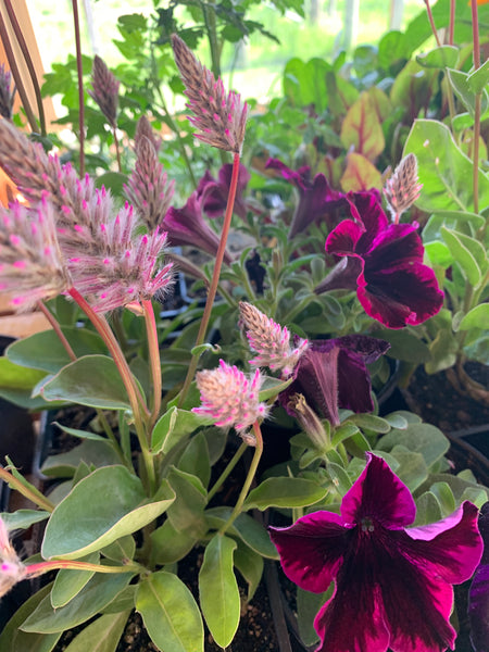
On my trips to the different nurseries in Central Oregon, I came upon this polka dot petunia. The white is certainly a spark. I added this to my idea of the magenta palette.

There is something about yellow flowers that always makes me smile. For years, I have grown sunflowers and marigolds and they will show up again this summer in my garden. As I scrolled through my quilt images “Paradise in the Garden” jumped out at me. It was made over ten years ago and won the imagination award in a Quilter’s newsletter challenge. What grabs me with this palette of fabric is that different shades of green unite all of the color. As I have said forever “green is nature’s neutral.


In Sisters, we are on the east side of the Cascade Mountains and it is much colder here than the Willamette Valley, which is on the west side of the mountains. My husband and I like to make a trip to the Wooden Shoe tulip farm in April for a spring color fix. The day we left Sisters and crossed the mountains this is what we found. I was on complete color overload and smiling from ear to ear.


As I studied these close up views of the tulips, it made me feel like I was looking at paintings. I can feel the layering of color like you see in hand painted fabric. Not only was I motivated with the color combinations but also wanted to get into the studio and do some ice dying and see what I could come up with.

As quilters we live a life filled with color opportunities. That is why I like to expose myself to new situations where I can be awed with color usage. I learn so much. If you study these photos from the tulip garden you will see that the color combinations do not quite fit any of the color palettes on the color wheel. Nature has a way of just creating beautiful, flowing color combinations and some form of green is usually present.
That takes me back to my basic color vocabulary that I developed for the classroom. I use the following words for reference in making color choices and discussing color during the design process.
Value - light – dark
Intensity – bright – dull
Temperature – warm – cool
Volume – heavy – light
Then I refer to the color wheel for complementary colors (colors that are opposite each other on the color wheel like red and greed, blue and orange, yellow and purple). If I am working on a quilt that is predominantly one color and it seems to need a spark I look at the opposite color on the color wheel.

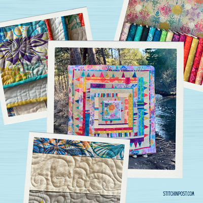
In the Hidden Stone quilt above, I began my palette with a challenge to myself to create a red quilt. I went into my fabric stash and pulled reds, pushing the red toward red orange and red violet. I was getting the depth that I wanted, but not the spark. As I searched for a color, my favorite color lime green came into play. Bits of the green just seemed to work in this quilt . You always want to make sure you use a smaller amount of the spark and it can be more intense as well.
Let’s not forget the word proportion when we are analyzing a photograph or fabric swatch. I have students view their image and write down or make a chart of the approximate percentage of each color compared to the whole.

As I get back to dreaming about my summer garden I think about a quote from Kaffe Fasset, “I’m an early riser so I love wandering in the quiet morning to see the delicate sunlight creep into the garden landscapes.” I could not agree more with Kaffe. In the early summer mornings you might see me outside in my enclosed garden in my pajamas admiring my plants.
I put together three new pencil packs inspired by this blog - Summer Bouquet, Walk in the Woods, and Morning Garden.