Dreaming in Color - Color Inspiration through Travel with Jean Wells
There is something magical about seeing a place for the first time. I was fortunate to be able to attend Valori Wells and Kelly Sheets Morocco Creatives Retreat in November. Valori has been to Morocco several times and her photos taken there made me want to visit. First of all it is a desert, high blue skies, arid, and full of people in Marrakech. We stayed at Peacock Pavilion just outside the city at a retreat villa.
Being in an unfamiliar environment, I always find new color combinations whether they are cultural, or in the environment. On vacation you are not dealing with day-to-day chores, so you are more open to the “wonder” of the unfamiliar.
My first thought when I saw this door was that the blue and orange are complementary colors on a neutral background. As I looked closer the subtle nuances in the neutral are what really intrigued me. There was so much richness. The surrounding neutrals seem to neutralize the impact of the complimentary colors. I had to take a second look.
Pattern and color are everywhere. The beads alone are a fabulous palette, but they stand out so well draped over the mostly black and white vases. The palette reminds me of my dear friend, Freddy Moran, who is known for working in this palette. The more I look at this photo the more I am tempted to get out my cropping squares and find even more palettes
I cut L shapes from heavy paper to use for cropping ideas.
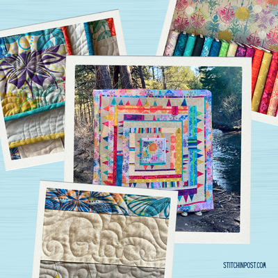
The framed piece of the photo inspired this month's fat quarter bundle. Can you see the similarities?
How many times have you seen a similar display of onions in the grocery store, but do not take the time to study the colors and take a picture. The salad presentation was a piece of art and gave me an idea to use at home. Garden colors have always been my favorite. I associate them with freshness.
This palette was familiar to me, but looking at the cactus up close, with it being against the terracotta wall, I saw more detail in the color as well as pattern and texture.
I was so taken by the simplicity of the desert and the complexity of the land shapes. There is something so calming about a neutral palette. The tent color on the hillside at this eco resort added an accent. You cannot forget the color of the sky, which makes the scene come alive. Not only was I interested in the colors, but the lines and shapes of the land were an inspiration too. When the camels arrived to take us for a ride they brought so much life to the scene.
The pond at the Marjorelle Gardens at the St. Laurent Museum was a feast of blues and greens with touches of terra cotta. I have been pulling together a palette of these colors without even knowing what I might create. They were so happy and summer feeling. Sometimes a season will be an inspiration.
Look at the intensity of color of these pod-like shapes. I use a term “pushing a color” when I want to pick several shades and tints of a color and this is definitely pushing orange.
And another version of blue, I would like to end this post with one last photo that depicts the pattern and colors of Morocco. What an inspiration travel can be when Dreaming in Color!