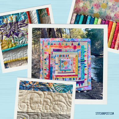
Dreaming in Color - Examples of Pushing Color with Jean Wells
February is always a favorite month for me as I start dreaming of spring and planting my garden. Half the fun for me is exploring what I might try to grow this year that is new to me and how I can couple it with my garden favorites. I love to try out new seeds starting them in the greenhouse, but for now I am still in the dreaming stage.
As I looked at our shipment of 24 new solids from Andover today, I began grouping them for our ever popular Pencil Packs. Customers tell me how these collections of solids are so helpful in extending their palette choices. Thinking about that reminded me of one of the concepts that I find so useful in quilt design - pushing a color. Pushing a color is a phrase that I use when pulling fabrics for a project. Once I have determined the colors I think I want to use, then I look for lighter, darker, brighter, and duller colors in the same family. You never know when you will need to pep up a color, or enrich it once you begin combining it with others.
Last year in April, John and I took a field trip to Woodburn to see the tulips. In this first tulip photo you can see the different value changes from red, to pink, to orange. In the closeup of the pink tulip, notice the solid red petals in the background and what the white mixed with the pink in the foreground of the tulips does in the composition. The deeper red is needed to complete the palette.
The color in the flower above varies from yellow to orange, and there is so much depth in the combination of values. Speaking of value (lightness and darkness of a color), this is a great example. The light yellow is almost white and feels cool next to the true yellow which feels warm. Then in the red-oranges you see the same thing. The petals toward the back are darker in value with the light values in the front. “Variety is the spice of life,” you always hear. Well, it is certainly true. Start noticing value changes in your surroundings.
Those photos inspired me as I was arranging colors for the pencil packs, and I really liked this mix. I named it Coral Magic. It just seemed to fit with the wide variety of colors. The deeper tones that are almost rust and a bit dull can be a foundation for the bright values in any palette you choose to work with.
This photograph of Wizard Falls on the Metolius River is a favorite of mine. The water is flowing fast through a volcanic fissure that is very deep. That aqua, blue green color is so difficult to describe, but once you see this body of water it is hard to forget it. Water Dance is the next pencil pack group I arranged featuring lagoon style blues inspired by Wizard Falls. The white adds an ice like cold feeling. When I see photos I am in awe of like this one, I write down words to describe what I am seeing beside the photo. Sometimes when you are in the creative process those words will help you in your journey as an artist.
In the photo of the river above you can see how the sky and the color of the water are similar - this happens a lot with the color of the water being a reflection of the sky.
The third group of colors I want to visit is represented in our Violette Grace Pencil Pack, named after my granddaughter. I think of violet as a softer purple leaning more toward red violet on the color wheel. Chives are the first flowers to appear in my planter boxes and a beautiful violet color. They are such happy flowers.
These beauties that are a bright purple are some of the first wildflowers you see along the Metolius River in May. If you mixed this color with the chives and the wonderful spring green you would have a dramatic color palette.
In parting, when you come across a single photo that just feels beautiful to you and you want to capture the essence of it, put on your detective hat and identify all of the color families in the photo. Then determine what percentage each of the families is to the whole and follow the formula that you have created. You are as attracted to the percentage of each of the colors as to the whole.
Keep Dreaming in Color!
Jean