Dreaming in Color - In the Garden with Jean Wells
It’s August already! Where did the time go? Many of you attended my “Dreaming in Color” Lecture series late this spring. After experiencing the stay at home order, I was really excited when Valori asked me to do the color lecture series. I finally felt like I had a purpose, and I could once again connect with many of you, which is what I love most about teaching. Not being able to travel and teach, I spend more time than ever in the garden and I think I have my best garden yet.
Gardens are great teachers for all of us and keep us humble. Best-laid plans do not always work with temperature changes, and the ever-present wind that we get in the late spring. I learn a great deal about color as I watch my flowers begin to bloom and burst into color. The changes in the individual flowers are like color inspiration in itself. For me one of the best experiences is throwing out “Cut and Come Again” zinnia seeds and seeing what colors appear. I take reference photos all summer long to use as prompts when working on new pieces.
Paradise in the Garden was created several years ago after planting the seeds I mentioned above at our old house. I really had no idea if they would come up, then they surprised me and did. What I learned from these colorful gems is that any color can work when there is some form of green with it, and it really doesn't matter what color is next to the other. I tell my students that the color green is nature’s neutral.
Bright, intense colors became more interesting to me at that time, and I started using them as a light values in my work rather than white or cream. In this close up, you can see how the melon like orange works as a light value.
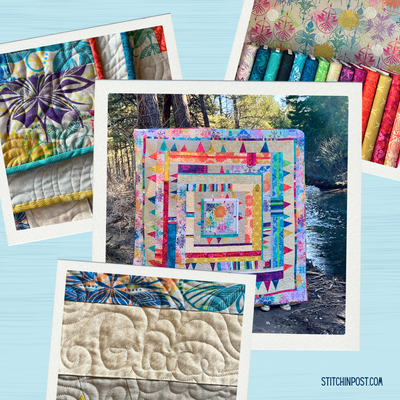
I have been preparing for an online class I am teaching, Adventures in Art Quilting, and use the color and value assignment on page 56 in “Intuitive Color and Design”, updated second edition. Choosing seven fabrics to work with is the first step. The apron display photo that I took in Morocco during the Creatives Retreat with Valori Wells and Kelly Sheets has been waiting to prompt me on color, so I worked with it. Working with a journal during the design process is very helpful to me.
The seven colors I choose are arranged in what I considered light to dark values. There are two surprises that appeared when I took a black and white photograph. The intense orange appears dark, and we know it isn’t in real life. (In black and white photographs brights will always appear as dark values.) The other surprise is that the last two fabrics on the right hand end need to reverse positions, as the raisin brown color is darker than the teal.
As I worked through the assignment of making nine simple blocks I found that the dull “raisin” color was very useful. So often as designers we forget the dull fabrics, and they really help the others colors in a palette to sing. I also found that the light pink worked well in most every combination. It is not a color I normally would have chosen to work with. Working from a photograph in choosing colors put me in a position of responding to what I saw that had interested me when I took the photograph in the tiny shop in Morocco.
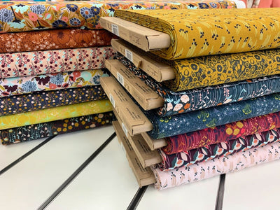
Needing a setting fabric for the blocks I had created I started auditioning possibilities. Nothing seemed to work, and was a distraction with the blocks. I remembered Freddy Moran telling me that white is like a beacon of light in the garden. Her contemporary home is painted black and she has numerous white flowering shrubs and plants as well as bright zinnias and petunias in her garden. That motivated me to look for black and white prints to use in creating a setting for these blocks. In an earlier blog this year I shared the photograph you see below of the colorful beads draped over the pottery.
In studying the photo I saw that the density of black vs. white changed in the individual pottery pieces, just like it does in black and white print fabrics. I started pulling black and white prints. Value changes started appearing when I laid them out. At this point it dawned on me that the density in the print contributed to the value changes. That excited me to see if I could make it work with my nine colorful blocks. As you can see, one of the prints has some color. I was attracted to the script writing so I cut around the colors and pieced the script together. You will notice that two of the prints have more of a muslin color background instead of white. I welcome these variations as I feel they make the quilt more interesting.
For this particular setting I stacked the blocks creating a color story and surrounded them with horizontal strips of black and white - beginning lighter at the top and getting denser at the bottom. I can hardly wait to begin quilting this piece, it reminds me of my fabulous adventures in Morocco.
This post inspired Jean to put together a new black and white Dreaming in Color fat quarter bundle.