Dreaming in Color - Neutral Like Colors with Jean Wells
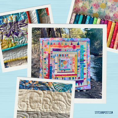
When our final shipment of the 100 Century Solids arrived this week, the first thing that crossed my mind is how neutrals and dull colors are so important in our world as makers. Neutrals have the job of holding up brighter more intense hues and adding a place for the eyes to rest in a composition. A winter walk provided me with more insight when considering how to use neutrals in my quilts.
I was so surprised to see the bright green and red/oranges willows among the dead branches. The grey and brown tones in the dead branches act as a backdrop for the new growth that jumps out at us. I could not get this image out of my mind, so got busy creating “Signs of Spring”.
Take a close look at the collage’ style piecing that I put together to represent the feeling behind the colored willows. I had never tried this technique before of creating the collage background, then cutting through it and inserting the willows. The angles and mixture of textures seem to work, and the neutral like tones did capture the mood in the photograph.
My mind began wandering to a color sample I had created on a small piece of canvas in similar colors. On it I used a glue stick to attach swatches of fabric to a small scrap of canvas. It then occurred to me that it would be fun to outline stitch around the swatches free motion style. Below are the results of that simple exercise. You will see an enlarged version of that simple exercise as well. I used the ruler-less cutting techniques from my book, Intuitive Color and Design 2nd edition, as the construction technique and added the outline stitching and free motion style quilting.
Take a look at how the neutrals are used in this piece. The warm cream color background takes center stage with a couple bits of cool white to add interest, along with several black and white neutrals. In order for the piece to be interesting I chose mostly patterned black and white prints. They end up creating the backdrop for the greens and tiny bit of orange. Although the black and white pieces were made before I saw the willows on my earlier walk they have a similar feeling.
My mind was still wandering back to the willows and I wanted to try out a non-traditional color interpretation of Signs of Spring. I used deep indigo blues as the backdrop for the willows and replaced the orange/red willows with magenta ones. Because the indigo blues are the darkest values, they act like as a dull neutral in this composition.
Sometimes, I feel like an explorer when I get excited about trying out some of the things that run around in my head. As a maker, I find if I try out these whims in small projects I can quickly tell if they are going to work or not. If they don’t feel right, I just move on, but I have not wasted a large amount of time and materials.
In my continued exploration of neutral like colors, I started going through images that depicted neutrals in different situations. Some have a warm feeling and some more of a cool feeling. Neutrals can be described just like pure hues. The examples below showcase different neutral palettes.
Last August, I was inspired to begin the quilt you see below titled “It is not Black and White.” All of the squares with stone shapes were sitting on my cutting table waiting to be included in a quilt. It dawned on me one day that I could collage them with other fabrics on a neutral background. In the close up version you see a large variety of neutrals. The grey in the stone has a blue cast. Some of the creams head in the warm direction, toward a warmer yellow, and others toward black that become cool greys. Variety is the spice of life even in a limited palette of colors.
The title of this quilt came from the unsettled feeling I had during late 2020 and early 2021. I added lots of decorative hand stitching as well as hand quilting and the whole time I was hoping that in the division we were feeling in America would evolve to a sense of peace. That is my hope for 2021.
Also during this time frame, I got the idea to remake a quilt I created over ten years ago in red and blue green with gold accent. My mini group choose the theme “Unhinged” for their 2021 group challenge. This is my version. Without the brass colored inserts this piece would not be as bold as it is. I used a variety of blacks, whites, and brass colored fabrics. If you look closely, you can see these slight differences.
Inspiration photographs not only give us color clues, but also patterning ideas. You can see how the worm wood patterns influence the embroidery below.
As I work through the design process I constantly think about color vocabulary. I find that these words are so helpful in determining which color will work best. Here they are again for you to think about.
Value – Light to Dark
Intensity – Bright to Dull
Temperature – Warm to Cool
Opposites – Complementary colors
If you are making a quilt that is mostly one color, when you add a bit of the opposite color on the color wheel it will make the quilt sing! When it comes to natural inspiration for color, Mother Nature does it beautifully! Clues surround you.
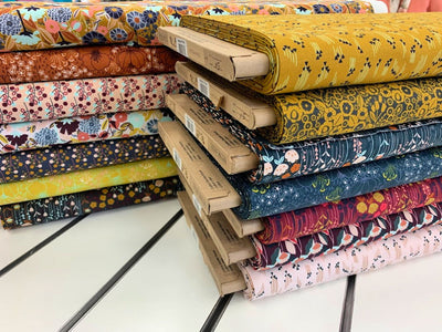
The colors in our pencil packs this month showcase duller colors and neutrals, with a bit of bright color. You never know when you are going to need a duller color or a neutral to make your project sing.
Woodland – browns with curry
Creekside – blues, green, white
Spicy – reds and oranges