Dreaming in Color - Supporting Colors with Jean Wells
Who would have thought we would be living through a pandemic and all it's changes? I am sure most of you are in “shelter in place” mode and that everyone is being extremely careful about being safe. Stitching and dreaming about color have saved the day for me during these difficult times, as well as other times in my life. I hope they do for you as well.
Before we jump into the post, I want to give a “shout out” to Valori and her team. Since this all started, they have stayed in touch with all of you through the Stitchin’ Post newsletter, filled many desperate orders, hand delivered some of them at the back door, and donated hundreds of yards of fabric for masks. Everyone is really pitching in. Violette and Olivia, Valori's 12 and 14 year old daughters, were helping until home school started up a couple of weeks ago. The girls learned to answer the phone, take and fill orders, and how to mail out goods. Their teachers were impressed, as was I, on what they learned to do. Stitchin' Post is a true family business.
Now, let's talk about color...
Spring is a fabulous time to observe color, as there are daily changes right outside the door. We are fortunate enough to be able to go on walks, and can take drives in the car, but stopping at parks and forest service viewpoints is currently prohibited. My friend Betty shared some photos from the tulip fields near Mt. Angel, Oregon with me. They reminded me of my tulip photo album, and how much flowers have been a color inspiration in my work.
Put on your detective hat when you study an image, and mentally take note of the proportions of the individual colors you are seeing. You are not only drawn to the color that jumps out at you, but the others that surround it. Those surrounding colors make the focal color interesting.
The yellow centers in the red tulips make the red even brighter. It is like a burst of sunlight. The duller greens surrounding the flowers allow the flowers to take center stage. In the photo of the feathered petal tulips, the glorious red orange grabs your attention, but notice how much green there is to support it.
The painterly feeling in the petals is so beautiful in the photo above. Notice how each of the flowers in the distance are slightly different color combinations. Look at how the white and the yellow become “beacons of light” in the composition. Years ago, my dear friend Freddy Moran shared that observation with me about white in a garden.
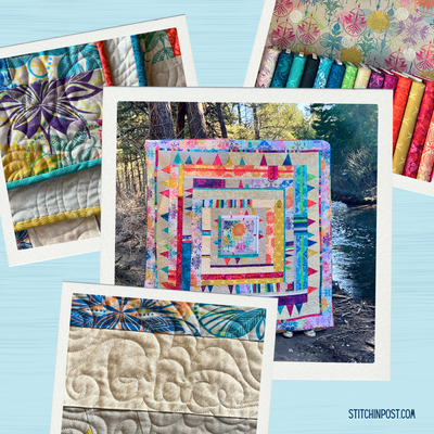
“Third Grade Art Class” is a quilt I purchased from Freddy that just spoke to me (pictured above). The wide variety of light values make the quilt more interesting than just one light color would. The strong intensity in the red and yellow brings life to the piece.
“Summer Garden” is a quilt that evolved over a year from my class samples, where I focused on similar summer colors. When I went to design the quilt, pure white just seemed to work to highlight the variety of design elements. Freddy and I used a similar palette, but the results are unique to each of us in the quilts we designed. This is the quilt that my publishers chose for the cover of my last book, Intuitive Color & Design.
I find myself going back to the basic color vocabulary that I mentioned in an earlier post whenever I talk about color. These descriptive words help you to have a conversation when you are working with color in a project, or just studying color. Let's review...
- Value - light vs dark
- Intensity - dull (muted) vs bright (clear)
- Temperature - cool vs warm
- Volume (weight) - light weight vs heavy
- Complementary Colors - opposites on the color wheel (great when you need a spark)
I find myself using the descriptive words above when I talk to myself during the design process, when I am troubled, or looking for just the right color. It occurred to me that these are also forms of contrast that are useful in the design process. I have a tendency to love colors that are all “comfy” together and have an elegance to them, but deep down I know if a design is going to work it needs contrast of some kind.
Living where I do, nature has been the inspiration I go to. There is something magical that I feel about the sky when I am standing in a grove of ponderosa pine trees looking up. The intensity (there is that word) of the blue against the green of the trees is so beautiful.
The movement of water in creeks and streams, and the colors that are created always interest me. I am so fortunate to live in Oregon, with clear, fast-moving water.
I am working on a mini group challenge quilt at the moment with the theme of “water dance.” All my stones are hand appliqued in place, and the French knots are the water droplets making their way through the stones. It is my current evening stitching project.
I have collected rocks and been fascinated by stone configurations my whole life… This newest untitled quilt of mine was inspired by high mountain streams and glacier stone. I began the process of gathering fabrics with the deep blue greens that I literally feel when I see these places. The ever present greys in the stones were just a given. As I built the palette, I remembered the intense yellow greens barely under the water that jump out at you, and the volcanic cinder stones. The palette just took on a life of its own when I let it, and this quilt was such a joy to make.
In closing, thank you for letting me talk about color and quilting, and feel like I am in the classroom again. I miss all of you special people! I cannot thank my daughter Val enough for carrying on so beautifully with the store and reaching out to all of you, along with her fabulous team, through her online newsletters. We can hardly wait to reopen our doors and set up a “socially distanced” classroom.
Jean fabric choices for this month's Dreaming in Color bundle were inspired by Freddy's quilt, "Third Grade Art Class." It, and Jean's other Dreaming in Color fat quarter bundles, are available here.