Dreaming in Color - Enrichment in Quilt Design with Jean Wells

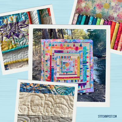
If you are like me there are times when you see a quilt that feels rich in color and you say how did they do that? Val pulled out several of her solid quilts this month for the Sisters Outdoor Quilt Show to feature on a video. When I saw her unfold “Colored Happy” it just grabbed me. I could not get the play of colors off my mind so I decided to talk about how we can use color in quilt design this month. There is so much variety in the colors she used, but yet the quilt is vibrant and feels harmonious.

Get the free pattern for Colored Happy here
As I studied the block design I realized that there are several unifying elements. The blocks are repeated. The asymmetrical placement of the vertical rectangle toward the block center is in a contrasting value that leads the eye around the quilt. I found myself isolating a single block then looking for others like it. There is variety in the color choices in each of the individual block units: light/dark, dull bright, warm/cool colors (Jean’s Color Vocabulary words). Some of the block combinations have less contrast within them than the others, which adds interest in the overall design.

This block is definitely an example of high contrast. The very light pink in the center of this block is the lightest value in the whole quilt. The placement of these blocks was important in the overall quilt design. All three of the pink/red blocks are in the top half of the quilt. The blue green block below is one of the low contrast blocks. These duller colors are the ones that help hold up the bright and lighter values in a design. Many times a quilter will ignore the dull tones not realizing how much work they can do in making the others feel important.

This brings up the conversation of the importance of “value” (light vs dark) in quilt design. I know from experience that most quilters are very comfortable with medium values. They easily will use a lighter value as a background and white is very popular with the modern quilters. In the store the duller dark values are the last ones to sell, but are so important to make the other more interesting color combinations sing. Take another look at the whole quilt image and see how the different blocks are distributed in the quilt. This will give you ideas of how to place colors in your work in the future. Don’t forget the power of neutrals with the greys in this quilt.
The quilt pictured below was the second one of the same design that I created after a late winter walk through a meadow near Sisters. The vibrant greens were so wonderful to see that time of year. In the first quilt the background was grey tones with the orange willow accent. (The willows I saw were green with a bit of orange on my walk.) I wanted to try the same quilt with a different palette, so I chose the indigos for the pieced background but replaced the orange color with magenta. Both the orange and magenta are intense colors and I find they both work well in combination with indigo and spring green. Again, you see dull colors as well as bright ones.

I couldn’t resist taking this photo in Sisters last week. The contrast of the neutrals in the wood building become a backdrop for the intensity of golden yellow daisies. Sometimes we forget about greys, browns, and off whites that can be very important as a foundation for the other colors in a composition.

Betty Gientke from Bend is a member of my mini group and has been exploring the pools in Yellowstone for years. She created the piece below for our “Water Dance” challenge in 2020. I am especially intrigued by the stunning variety in the blue color family. She pushed it from deep and dark to bright aqua. Then take a look at how she used the soft brown neutrals between the blues and the greens. The warm browns on the outer edge help to contain the pool in the center of the quilt. Everywhere you look you see interesting combinations in the color family. To me this quilt is very powerful not only because of the colors but also the shape of the quilt. Again you see value and intensity variations.

You never know what you are going to see when you walk slowly looking up and down and all around. On the day of the Sisters Outdoor Quilt Show I walked to the far end of our building to see a quilt hung between the trees and saw all these moths on the pavement in the shade. I captured this one while it was resting. The play of the cool greys and pink with the warm brown was very interesting to me. The accent of the pink was such a surprise as it does not show when the wings are closed. When you work with the color vocabulary don’t forget about temperature, warm vs cool.

Jan Tetzlaf is from Bend and we are on the Sisters Outdoor Quilt Show board of directors together. She created this beautiful leaf quilt for our storybook project this year. The variety of colors she used in the smaller leaves that make up the large leaf shape create so much interest in the design. Some are dull, while others are bright, some are light, others dark, as well as warm and cool. In my opinion they are even more stunning surrounded by the bright spring green color. I have always felt that some form of green can work as a neutral. Go back and take a look at some of the small individual pieced leaves and you will see that some are lower contrast and some are higher contrast. Contrast is so important when you are planning the colors for your quilt. The variety of the line work patterns also adds interest.


For years I have been telling my students that some form of green can save the day in a quilt. Nature showcases green so well. Below is a selection of greens from cool to warm, bright to dull, light to dark.

A trip to Pacific Grove last month reminded me of the variety of blues in the sky and ocean. Look how the white waves add interest. In closing I hope you will take time to think about color in your daily lives no matter where you live and that looking at others quilts opens your eyes to new possibilities.